Bill payment for corporates
The aim of the project is to enhance the BillPay experience for corporate bank account users.

Problem
The existing BillPay interface is complex and unintuitive.
Users face a high number of clicks to complete payments.
We talked to a few potential users and created persona’s for users from multi location retail businesses, IT and retail shop. even though our users majority are from IT and multi location retail businesses, we wanted to understand all type of users to explore opportunities.

Mohan Patel
Age
35
Location
Pune, India
Occupation
Finance Manager at Deep Retail Corp
Technology Comfort Level
Moderate
Daily Tasks
Review incoming bills and categorize them based on priority.
Manage and authorize payments for multiple locations.
Reconcile payment records with bank statements to ensure accuracy.
Generate reports for upper management to assess financial performance.
Goals
Vendor Relationships: Building and nurturing strong relationships with vendors and suppliers.
Technology Adoption: Mohan embraces automated payment systems, digital invoicing platforms, and data analytics tools to enhance payment efficiency and financial visibility.
Cost Optimization: He focuses on optimizing costs related to bill payments.
Painpoints
Finds the current payment system complex and unintuitive, often requiring too many clicks to complete transactions.
Making individual payments is time consuming and prone to errors.
Manual data entry of bill details to make payments is time consuming and error prone.
Managing bills from multiple locations
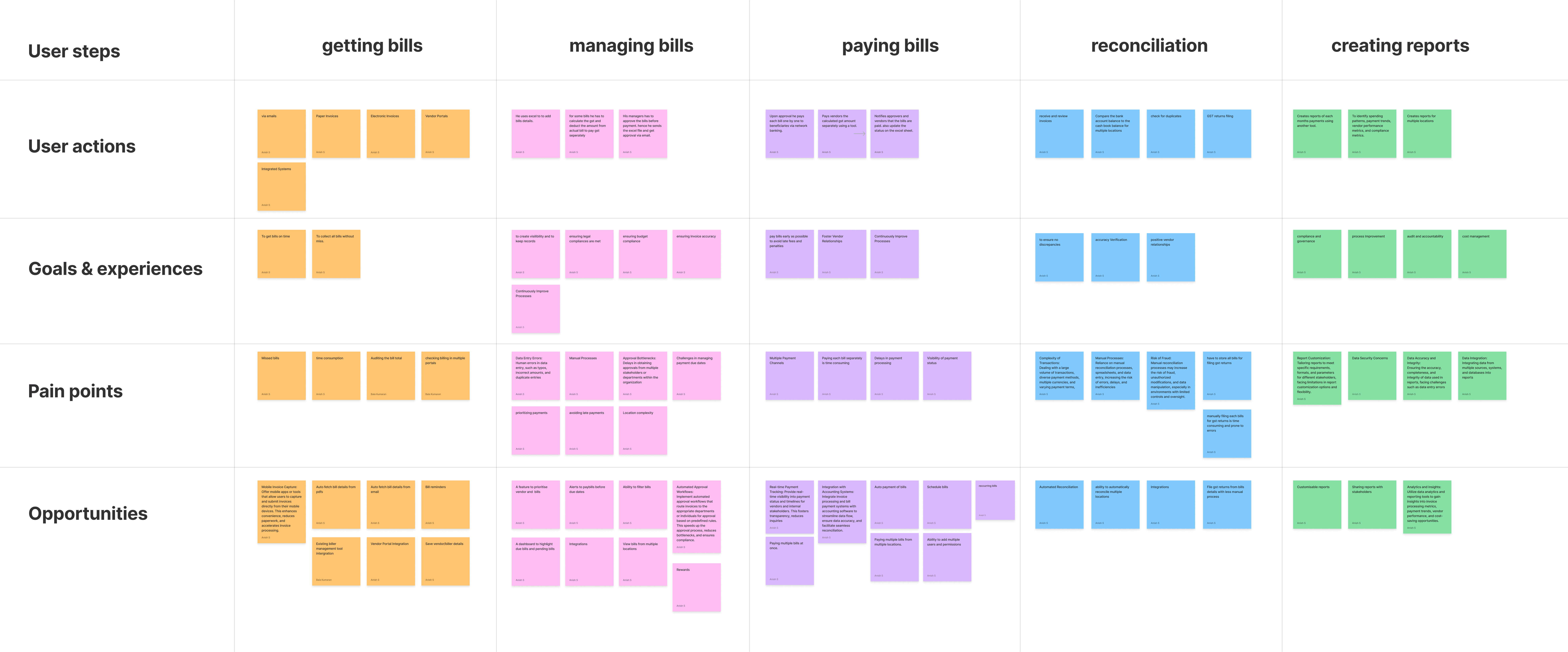
Journey map
We aimed to clearly understand the typical user's day-to-day tasks to explore more possible opportunities within the BillPay platform. To map out the user journey, I divided tasks into five stages: getting bills, managing bills, paying bills, reconciliation, and creating reports, used gathered information from interviews and stakeholder discussions.
Feature prioritisation

Current scope
After several back and forth discussions between stakeholders, we finally decided to add the new features in phases and first phase would be primarily focusing on visual and usability/ experience improvements.
Improvements in payment flow
Streamline the payment process to minimise steps and improved clarity on statuses, micro interactions and feedbacks.
Recharge flow UX simplification
Current recharge flow isn’t smooth and user has to go through unnecessary pages and clicks, we decided to simplify the recharge flow.
Intuitive Experience
Create a user-friendly interface for easier navigation and transactions.
Applying new design system
We already finished designing the new design system for our products and plugins, hence decided to apply the same with different color variables to match HDFC’s brand.
Information architecture
Created with bulk payments in mind as it would be coming in next phase.

Some early stage lo-fi wireframes

Final designs
We already finished designing the new design system for our products and plugins, hence decided to apply the same with different color variables to match HDFC’s brand.
Add Biller
Updated design
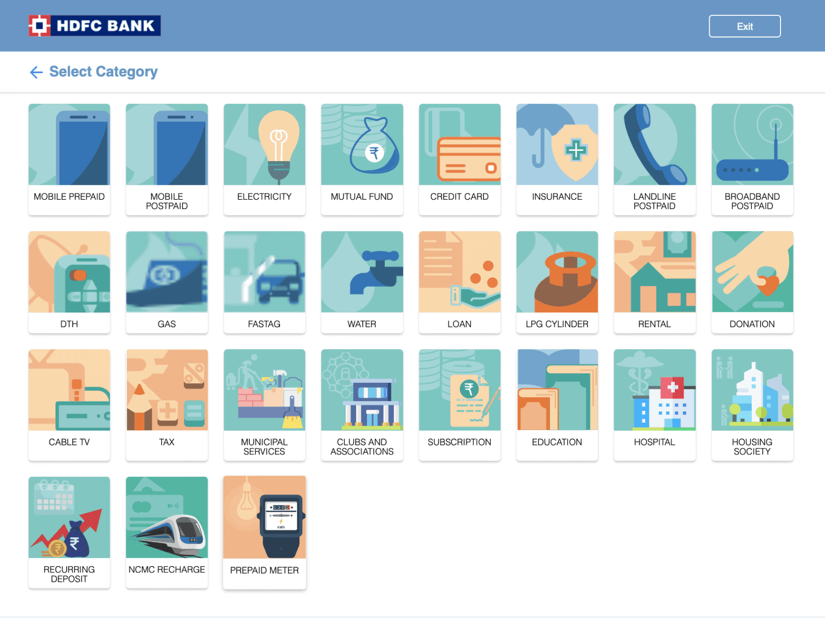
Scanning through a long list to find the biller category can be cumbersome. In the updated design, we focused on improving the user experience by simplifying this process.
Reduced columns to easily scan with less eye movements.
Grouped billers into logical subcategories, improving findability and reducing cognitive load.
Added live search to quickly select a category
Added a clickable index on the left side for faster navigation, enabling users to jump directly to their desired category without scrolling.

Current
The current design uses multiple columns, which require significant eye movement and make it harder to focus on the right category.
Lacks any logical grouping of categories or an indexing system, making it difficult to locate specific billers.
There is no search function, forcing users to visually scan through the entire list, leading to inefficiency.
Pay Bills
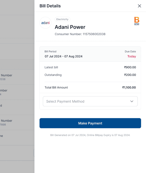
Updated design
The new design only shows billers when a new bill is generated, removing unnecessary clutter.
Navigation is now upfront increasing visibility
Important due dates are highlighted in red, alerting users to upcoming deadlines.
An added search feature improves efficiency, especially for users handling multiple bills.
To avoid "choice overload" or "analysis paralysis," the color on the pay now buttons has been removed, minimizing distraction and focusing the user's attention on key actions.


Current
Displays all billers, even without new bills, making it difficult to find new generated bills. User has to click on pay bill to see if a bill generated
The current version lacks clear alerts for due dates and doesn’t include search options, making it harder for users to locate specific bills quickly.
Also the navigation is hidden with a hamburger icon, decreasing visibility and accessibility on features.


Make Recharge
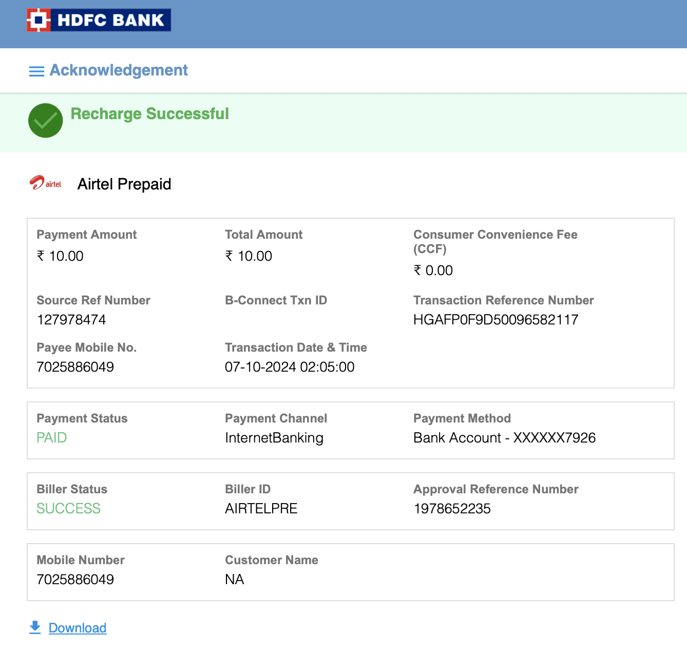
Updated design
Reduced number of clicks to complete a recharge.
The last recharge is preselected, As there is a higher chance among corporate users to proceed with last recharge.
Recharge plans are now upfront without clutter and removed manual entry of plan to avoid errors.
Improved readability with better spacing and typography.

Current
The previous version of the recharge flow was cluttered, requiring users to browse through a large amount of text to select a plan.
Important options like the payment method and recharge button were not as visually prominent, also manual entering recharge amount is prone to errors.

